Be patient..... we are fetching your source code.
Objective
Main objective of this blog post is to give you an idea about how to use Grid Framework Using in Responsive website.
Step 1 Introduction
- Grid Framework is a very simple and responsive framework that you can use in your websites and other projects.
- The basis of the grid is a container.container class with a width equal to 80% of a screen of desktop or 96% of a mobile phone.
- This container.container class is divided into 16 columns. So, no matter what the device is, your website will be 80% or 96% broad.
Step 2 Easy to start
- Grid Framework does not have a hard structure and you will learn it soon. It is not User Interface Framework:
- This is just a simple grid ensuring responsiveness for uncomplicated projects.
Step 3 Includes Media Queries
- Simply Grid Framework works on two hops.
- Between 480px and 768px
- Less than 480px All browsers support
Step 4 Grid Framework
- Simply Grid Framework works on all the browsers like Mozilla Firefox, Google Chrome, Internet Explorer, Safari, and Opera Mini.
4.1 How does it work?
It is very easy to use Grid Framework:
- All Rows must be placed within a .container(width 80%)class. If you require 100% width than you can use .container-fluidclass.
- Use it in horizontal column groups.
- Columns ( .col-2 , .col-4 ) must be in .row-content
- Columns don’t have default padding.
- If you want a padding then use the .box class
Note: .box has default padding of 20px.
4.2 How to use
Create a basic HTML file.
<!doctype html>
<html>
<head>
<meta charset="utf-8">
<title>Demo</title>
    <link type="text/css" rel="stylesheet" href="css/grid.css">
</head>

<body>
<div class="row-content">
<div class="container">
<div class="col-16">
<div class="col-4">
    <p>Lorem Ipsum is simply dummy text of the printing and typesetting industry. Lorem Ipsum has been the industry's standard dummy text ever since the 1500s, when an unknown printer took a galley of type and scrambled it to ssmake a type specimen book..</p>
</div>

<div class="col-4">
    <p>Lorem Ipsum is simply dummy text of the printing and typesetting industry. Lorem Ipsum has been the industry's standard dummy text ever since the 1500s, when an unknown printer took a galley of type and scrambled it to make a type specimen book..</p>
</div>

<div class="col-4">
    <p>Lorem Ipsum is simply dummy text of the printing and typesetting industry. Lorem Ipsum has been the industry's standard dummy text ever since the 1500s, when an unknown printer took a galley of type and scrambled it to make a type specimen book..</p>
</div>

<div class="col-4">
    <p>Lorem Ipsum is simply dummy text of the printing and typesetting industry. Lorem Ipsum has been the industry's standard dummy text ever since the 1500s, when an unknown printer took a galley of type and scrambled it to make a type specimen book..</p>
</div>

</div>
</div>
</div>
</body>
</html>
4.3 Output:
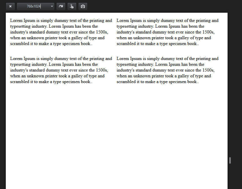
On a 768*1024 screen:

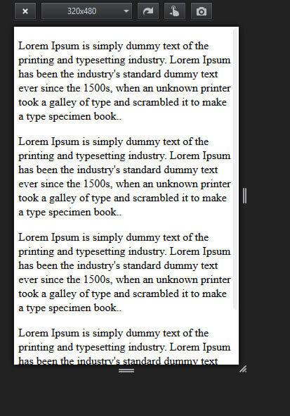
On a 320*480 screen:

Step 5 Offsetting columns:
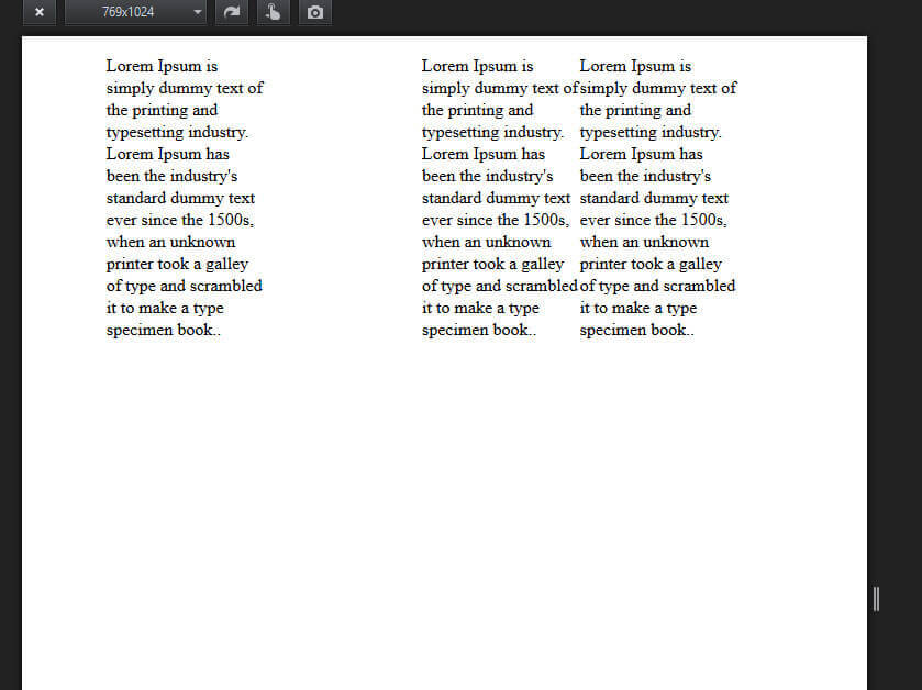
- Columns can be moved to the right hand side of the class using .col-offset-1 to .col-offset-16.
- Each class increases the left margin of a column to a whole column which is below 768px width.
Code:
<div class="row-content">
<div class="container">
    <div class="col-16">
        <div class="col-4">
    <p>....</p>
</div>

<div class="col-offset-4"></div>

<div class="col-4">
    <p>....</p>
</div>

<div class="col-4">
    <p>....</p>
</div>

</div>
</div>
</div>
Output:
On a 769*1024 screen:

Step 6 Nesting columns
To nest your content with the default grid, add a new .row-content and set of .col-*columns within the existing .col-*column.Code:
<div class="row-content">
<div class="container">
<div class="col-8">
<p>....</p>
<div class="row-content">
<div class="col-6">
<p>....</p>
</div>
<div class="col-6">
<p>....</p>
</div>
</div>
</div>
<div class="col-8">
<p>....</p>
</div>
</div>
</div>
Output:
On a 1366*768 screen:

Note:
In order to use grid framework, you need to attach style.css file to your html file.
I hope you find this blog very helpful while working Responsive Website Using Grid Framework. Let me know in comment if you have any question regarding Responsive Website. I will reply you ASAP.
Got an Idea of Responsive Web Development? What are you still waiting for? Contact us now and see the Idea live soon. Our company has been named as one of the best Responsive Web Development Company in India.

UIAlertController in Swift Tutorial
