Be patient..... we are fetching your source code.
Objective
Main Objective of this blog post will enable you to get skilled with using Auto layout, So that you can easily use it in your Applications using Interface Builder.
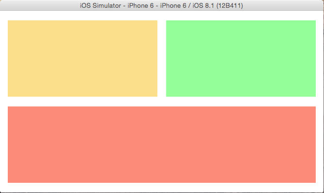
You will get Final Output:
a) Portrait View:

b) Landscape View:
Step 1 Open Xcode
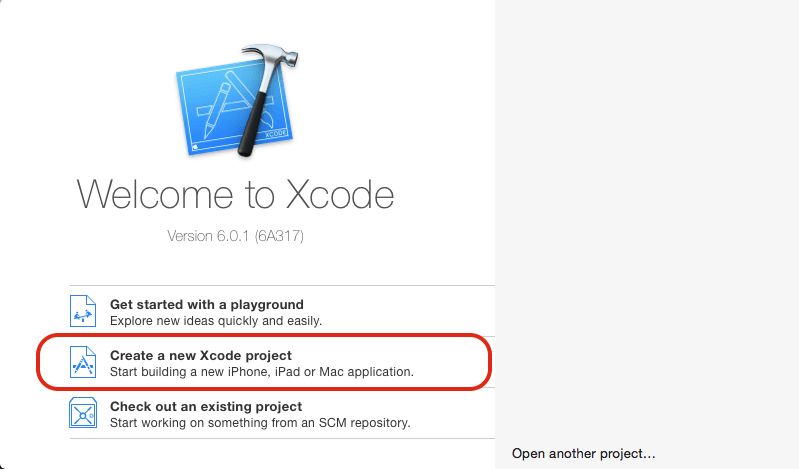
Open Xcode and select Create a new Xcode project.
Step 2 Select View Template
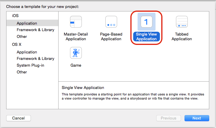
Select Single View Application from given list of templates.
Step 3 Fill your Project Detail
Name the product as AutolayoutDemo and fill rest of the details, do select the device as iPhone.
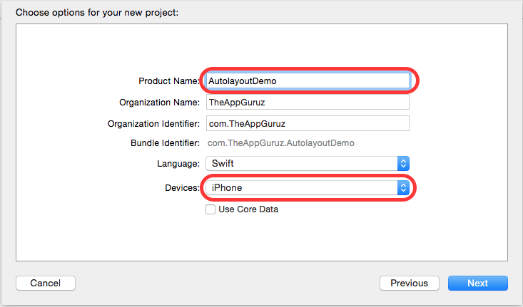
Step 4 Design UI
Now go to storyboard and create the given interface.
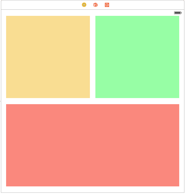
We have three views each of height 270 arranged as shown in screen.
Step 5 Run App in Landscape & Portrait mode
Run the app and you would see following output in the Landscape and Portrait mode:-
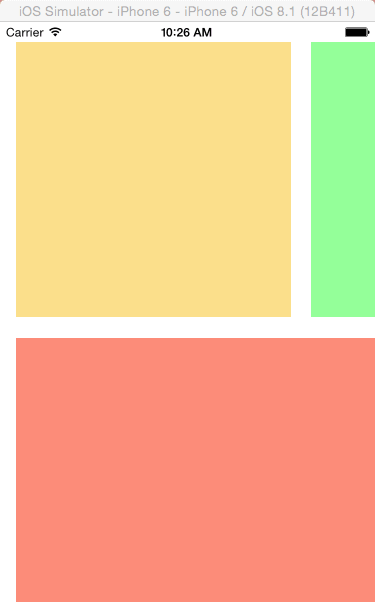
Portrait View
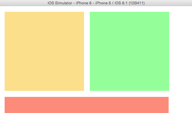
Landscap View
Now this is not what we expected.
Step 6 Check Use Autolayout
Lets start with Auto layout now to make our Design as desired in both Landscape and Portrait View. But before we start with using Auto Layout we need to change one property of our StoryBoard :-
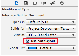
Step 7 Set constraints
Now Lets start providing the constraints.
- From the layout of screen we can see that we want the upper two views in screen to be of Equal Widths and the Horizontal Spacing between them as much as we have kept in screen. So we have identified our constraints now its very easy to add them.
Just go through following steps:
a) Hold down the ? key while you click on the two views on the top , so that both are selected. From Xcode’s Editor menu, select Pin\Widths Equally.
b) Even though two views appear selected once the first Pin action is performed, note that they are in a special layout relationship display mode. So you dhave to reselect both the views. Select the same views again and select Editor\Pin\Horizontal Spacing.
Below figure shows how to select the Constraint for menu:
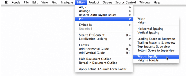
So our constraints that we identified Equal Widths and Horizontal Spacing between views are set.
The storyboard now looks like this:
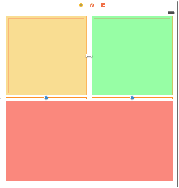
Constraints express relationship among views and are primary tool you use to build layouts using Auto Layout. This might seem scary initially, but it is quite straightforward once you learn what it means. To continue building the layout for this screen go on performing the following steps as given. Each step will adds more orange T-bars constraints.
Step 8 Use below menu options
For view on the left, select from the Editor\Pin menu:
- Top Space to Superview
- Leading Space to Superview
The storyboard now seems like this:
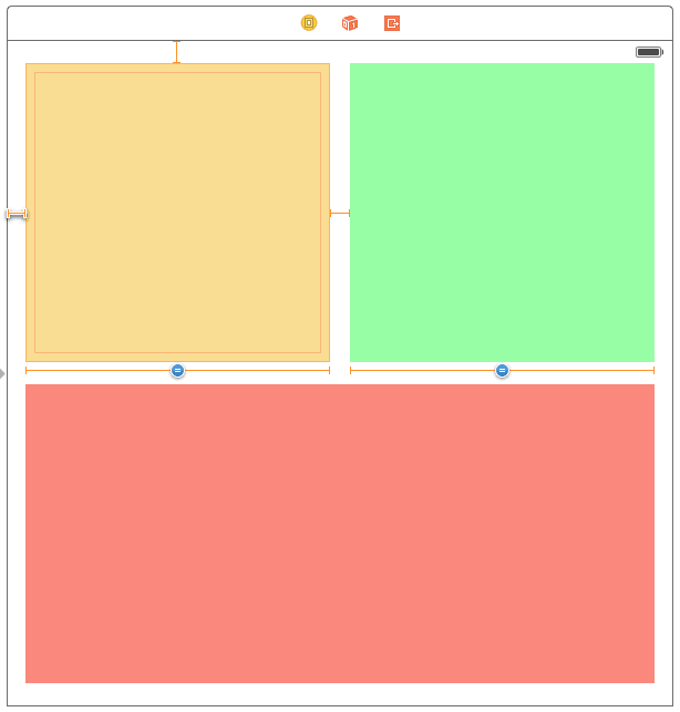
Step 9 Right View set
For view on right, Select:
- Top Space to Superview
- Trailing Space to Superview
The storyboard now seems like this:
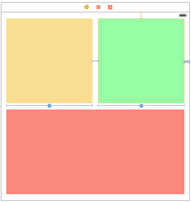
Step 10 Bottom view set
For big view at the bottom:
- Leading Space to Superview
- Trailing Space to Superview
- Bottom Space to Superview
The storyboard now seems like this:
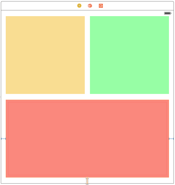
Step 11 Complete Orange incomplete Constraints
Notice the T-bars are still orange. This means that your layout is yet incomplete; Auto Layout does not have enough constraints to calculate the position and size of the views. As a solution we have to add more constraints till they turn blue. So to move ahead hold down ? and select all three views. From the Editor menu, select Pin\Heights Equally.
The storyboard now seems like this:
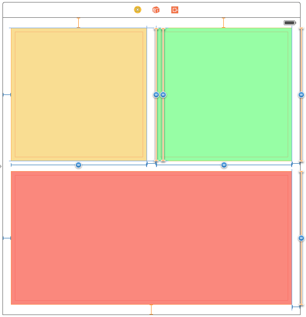
Step 12 Final setting for layout
Now select the top-left corner view and the bottom view using ? key, and select Editor\Pin\Vertical Spacing.
The storyboard now seems like this:
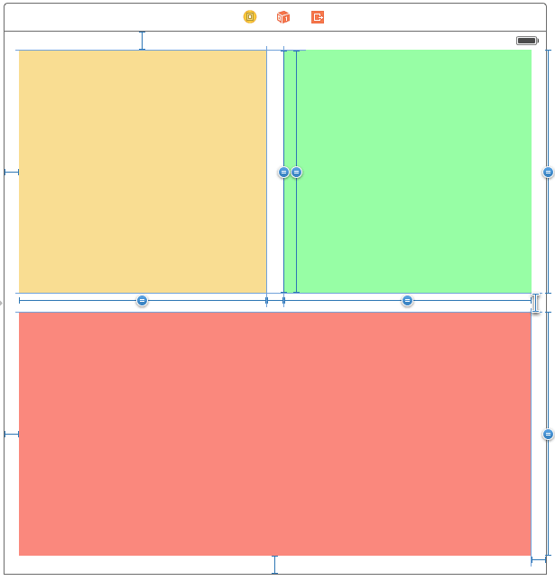
And we are done Layout has enough constraints to calculate the positions and sizes of the views and we have all our constraints blue. That’s it as simple as it seems.
Step 13 Run demo
Run the app for different devices in Landscape as well as Portrait view and notice that our Layouts remain as we desired.
Output of iPhone 6 are showmn below:
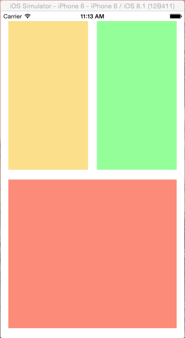
Portrait View

Landscape View
I hope you will find this blog post very useful. While using autolayout in iOS. Let me know in comment if you have any questions regarding autolayout in iOS. I will reply ASAP.
Got an Idea of iPhone App Development? What are you still waiting for? Contact us now and see the Idea live soon. Our company has been named as one of the best iPhone App Development Company in India.

I am an iOS Developer and I Personally believe that Mobile applications are the best ways to convert your innovative ideas in to reality in quickest way and help people make their life a joy with technology.
General Sharing in Android & iOS in Unity
